STARCO Logistics
Construction Logistics Services • Sampit, Indonesia
Layanan Logistik Konstruksi • Sampit, Indonesia
Project Overview
Tinjauan Proyek
John owns a construction logistics company operating in Sampit, Indonesia. His vision is to accelerate regional growth by serving Property Developers and Construction Contractors with specialized material transportation and warehousing facilities.
John memiliki perusahaan logistik konstruksi yang beroperasi di Sampit, Indonesia. Visinya adalah mempercepat pertumbuhan regional dengan melayani Pengembang Properti dan Kontraktor Konstruksi melalui transportasi material khusus dan fasilitas pergudangan.
Vision & Values:
Visi & Nilai:
- Bold & Trustworthy Identity
- Identitas yang Berani & Tepercaya
- Reliability in Distribution
- Keandalan dalam Distribusi
- Steadfast Construction Logistics
- Logistik Konstruksi yang Kokoh
The Design Process
Proses Desain
1. Visual Inspiration & Typography
1. Inspirasi Visual & Tipografi
After exploring various industrial-themed mood boards, we selected Hussar Bold as the primary typeface. John chose this font because of its strong, upright character which perfectly complements a monogram-themed design for a heavy-duty logistics brand.
Setelah mengeksplorasi berbagai mood board bertema industri, kami memilih Hussar Bold sebagai typeface utama. John memilih font ini karena karakternya yang kuat dan tegak, yang menyempurnakan desain bertema monogram untuk brand logistik alat berat.
2. Sketching the Concept
2. Mensketsa Konsep
Using Hussar Bold as a foundation, the sketching phase focused on integrating a tire/gear element into the typography. This stage involved several revisions to ensure the logo exuded strength and professional reliability on paper before going digital.
Menggunakan Hussar Bold sebagai fondasi, tahap sketsa difokuskan pada pengintegrasian elemen ban/gir ke dalam tipografi. Tahap ini melibatkan beberapa revisi untuk memastikan logo memancarkan kekuatan dan keandalan profesional di atas kertas sebelum beralih ke digital.
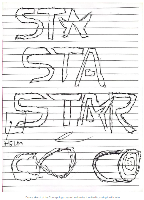
Initial hand-drawn concept sketches capturing the industrial essence of STARCO.
Sketsa konsep awal yang digambar tangan, menangkap esensi industri STARCO.
Final Identity & Digitalization
Identitas Akhir & Digitalisasi
The conclusion of the sketching phase led to a sleek digital format. The final logo successfully incorporates a stylized tire in the 'O', representing movement and the logistics domain, while the helm symbol emphasizes safety and coordination.
Kesimpulan dari tahap sketsa menghasilkan format digital yang rapi. Logo akhir berhasil menggabungkan ban bergaya pada huruf 'O', mewakili pergerakan dan domain logistik, sementara simbol helm menekankan keamanan dan koordinasi.
Main STARCO Construction Logistics Services logo design.
Desain logo utama STARCO Construction Logistics Services.
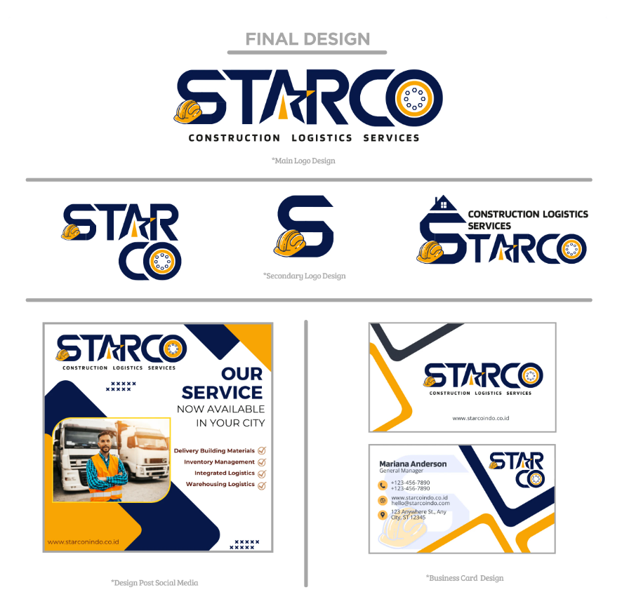
Branding implementation for social media and business promotion materials.
Implementasi branding untuk media sosial dan materi promosi bisnis.
Color Palette & Brand Collateral
Palet Warna & Jaminan Brand
To resonate with the construction industry, we used a high-contrast palette of Midnight Blue and Construction Orange. This ensures visibility and trust across all collateral including ID cards and business documents.
Untuk beresonansi dengan industri konstruksi, kami menggunakan palet kontras tinggi Midnight Blue dan Construction Orange. Hal ini memastikan visibilitas dan kepercayaan di semua jaminan termasuk kartu ID dan dokumen bisnis.
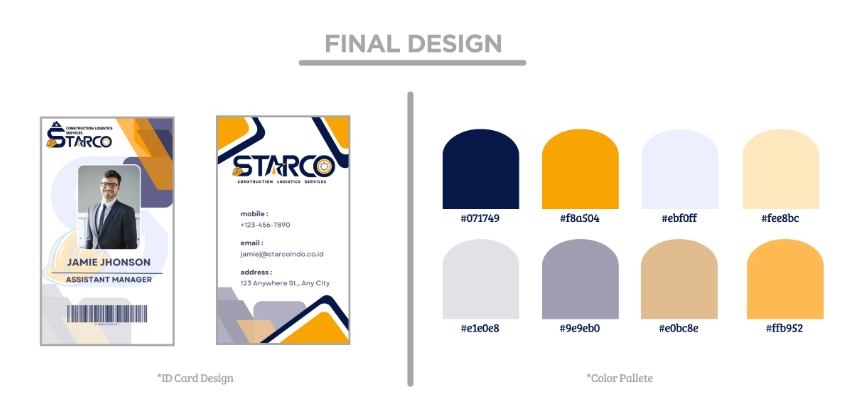
Detailed brand guidelines showing the color palette and ID card designs.
Panduan brand mendetail yang menunjukkan palet warna dan desain kartu ID.